
A Refined Identity for Johnston Parke Interiors
A brand refresh and website transformation for a timeless design studio.
Johnston Parke Interiors is a high-end residential and hospitality interior design studio with over 15 years of experience creating elegant, classic yet approachable homes. Their reputation is built on reliability, trust and expertise, but their old branding and website no longer reflected who they were.
As their business evolved, so did their goals. They wanted to focus on fewer, higher-value projects, introduce new services like eDesign and attract clients who valued collaboration as much as creativity. Above all, they needed a brand that felt timeless, personal and confident, while keeping the warmth and approachability that defines their work.


Images all Johnston Parke Interiors
Design Direction
From the beginning, it was clear that Johnston Parke needed a balance of timelessness and personality. We explored the idea of a classic typographical foundation with additional unique elements, a sophisticated colour palette and subtle detail woven throughout.
As always with my clients, their overall values guided the creative direction: Trust and reliability. Tailored and personal. Approachable expertise. Creativity and detail.
One thing became obvious in our research: their old branding was somewhat muting their personality. Johnston Parke’s style is timeless, yes, but never bland. Their new identity needed to embrace colour and character while still feeling grounded and refined. We looked at shape, pattern, connection and flourishes during the exploration process.
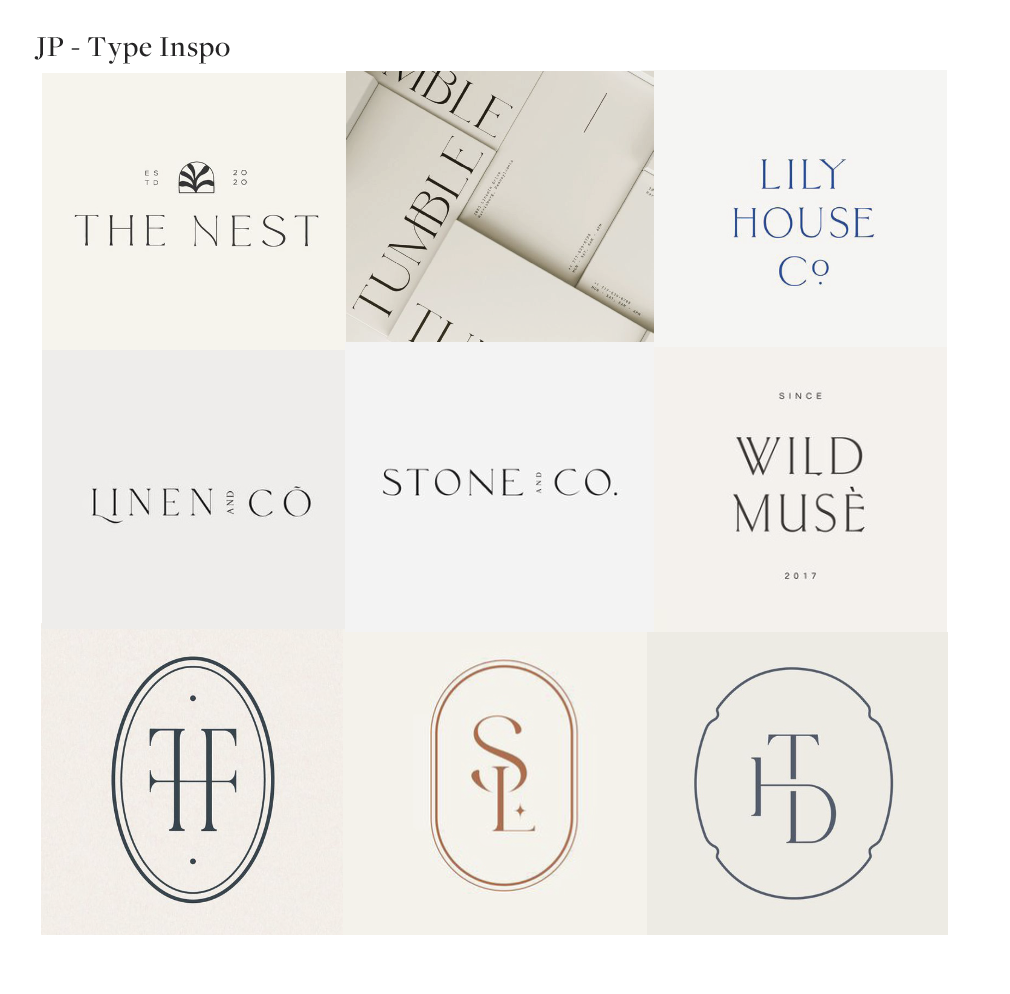
Type and monogram exploration (source: Pinterest)
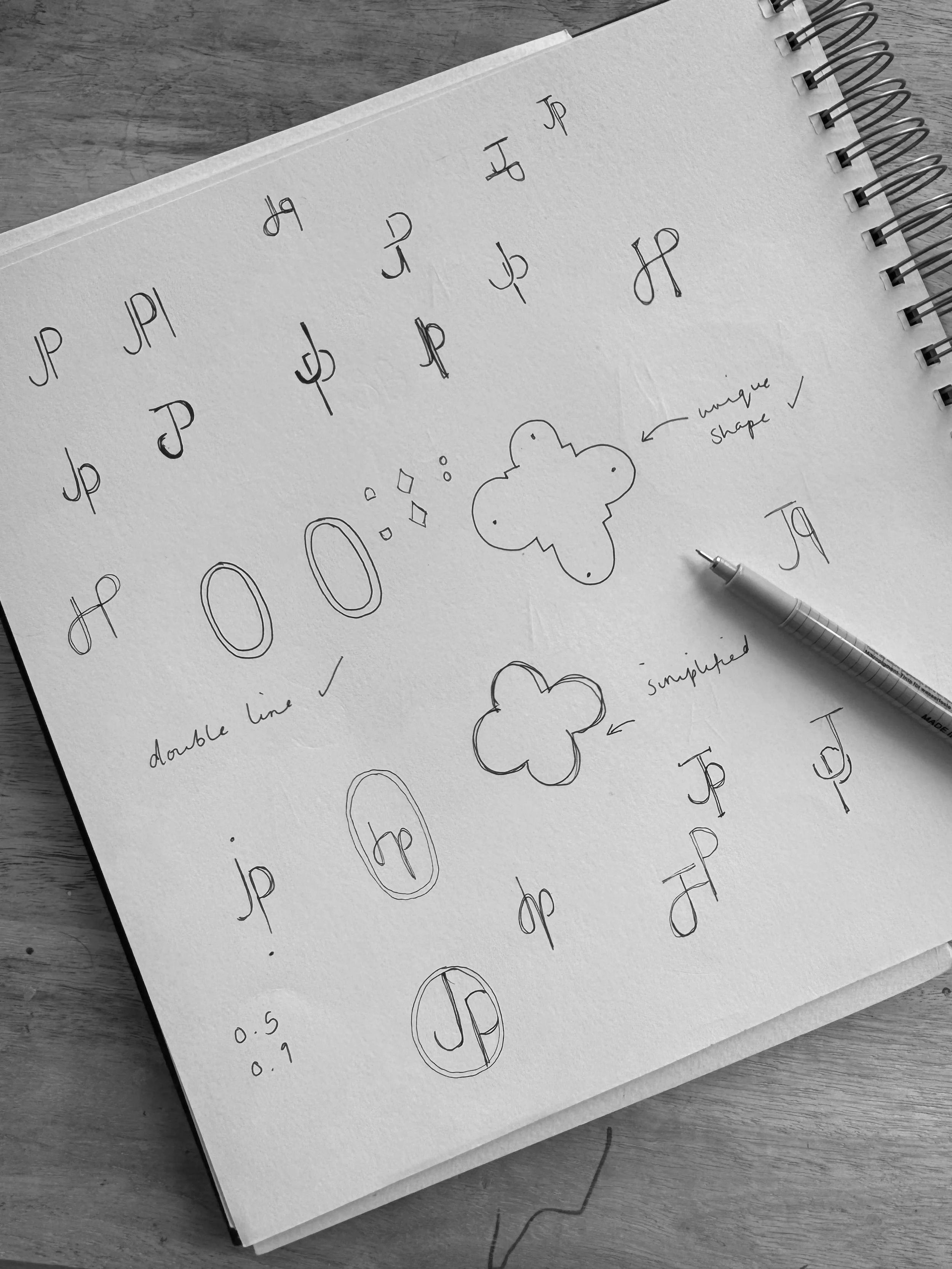
Initial sketch ideas for the monogram
The Brand Identity
The final identity pairs elegant typography with clean, modern details, supported by a palette of deep, confident hues. A custom-designed monogram was created to capture Johnston Parke’s creative spirit while elevating the elegance of their brand.
The result: a holistic, timeless identity that feels just as classic as Johnston Parke’s interiors, but with personality woven through every detail.


The Website
The new website needed to be as practical as it is beautiful. With clear navigation and thoughtful layouts, it highlights Johnston Parke’s portfolio while supporting their new service offerings.
Key features include:
A refreshed portfolio layout that puts timeless, colourful interiors front and centre
Dedicated service pages for eDesign, procurement and consultations
Clear enquiry process so the right clients can connect easily
The result: A site that feels warm and approachable, giving prospective clients the confidence that they’ve found the right team whilst also showcasing Johnston Parke’s beautiful and thoughtful work.

Final Thoughts
Johnston Parke Interiors now has a brand and website that reflect both their heritage and their ambition. Their identity communicates trust, creativity and collaboration, positioning them perfectly for the next stage of growth.
The founder, Fiona, shared this lovely feedback:
“We worked with Isabel & Ink to rebrand our interiors business from scratch; logo, colours, typography and our website and we couldn't be happier. She completely understood our style and how we wanted to portray ourselves to our clients.”
How I Might Be Able To Help:
If you’re realising your branding or website could use more than a few quick tweaks, this is the perfect time to plan ahead. From spring 2026, I’ll be re-opening my books for new branding and website projects, and my waitlist is now live.
Join the 2026 Waitlist Here
Explore My Brand & Website Packages
