What File Formats Do I Need for My Logo? (And Why You Should Never Settle for a Fuzzy PNG)
A clear guide to logo files that keep your brand sharp, professional and future-proof.
I’ve been in the design industry for over 15 years, and one thing I see time and time again is the fuzzy logo problem. A client comes to me with a logo that looks blurry, pixelated or just not fit for purpose. Sometimes it was DIY’d. Sometimes it came from a cheap online package. Sometimes a designer friend only handed over a single PNG file.
The result is always the same: frustration and limitation.
Here’s the truth, if you’re paying for professional logo design, you should always be provided with your logo in all the formats you’ll need across digital and print. Anything less is problematic.
I’m a firm believer that you get what you pay for, especially in design. A low-cost logo might seem fine at first, but without the right files behind it, you’ll quickly feel stuck and your brand ends up paying the price.
This post breaks down the essential logo file formats every business owner should have, why they matter, and how to make sure you’re not left with a fuzzy PNG again.
1. The Core Logo Formats You Should Have
Your logo comes in several file types, each designed for a different purpose.
JPEG (or JPG):
Best for online use like your website, email signatures or social media. Great for photos, but JPEGs don’t support transparency, which means they’ll always sit on a block background (white or colour).
PNG:
Perfect for digital use when you need a transparent background (so your logo can sit neatly on top of a coloured background or image). Ideal for web overlays, presentations or social graphics.
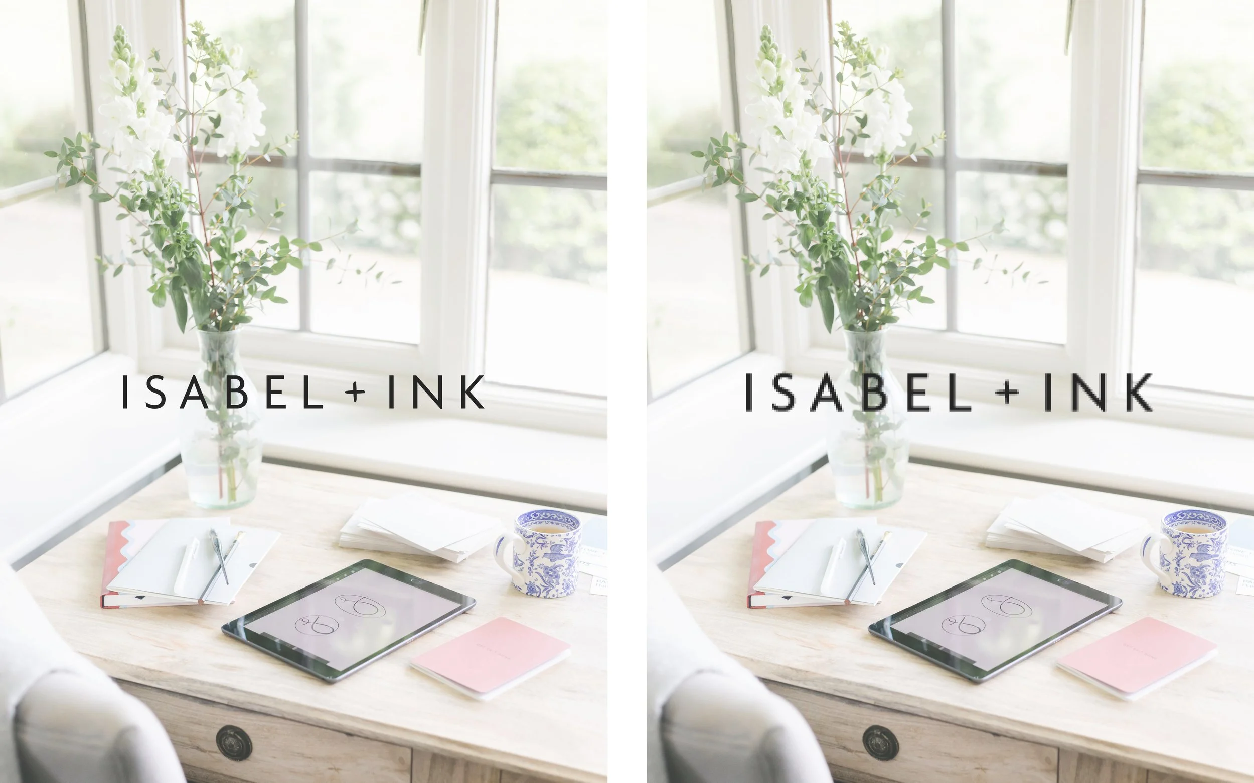
EPS (or SVG):
This is the non-negotiable format. EPS and SVG files are scalable vector formats, which means your logo will look sharp and crisp no matter the size, from a tiny Instagram profile image to a six-foot trade show banner. Without this, you’re left stretching a PNG beyond its limits, and that’s where fuzziness creeps in.
(Bonus: Some designers also provide PDF or AI files, which are editable in Adobe Illustrator. These aren’t always essential for everyday use, but they’re nice to have in your toolkit.)
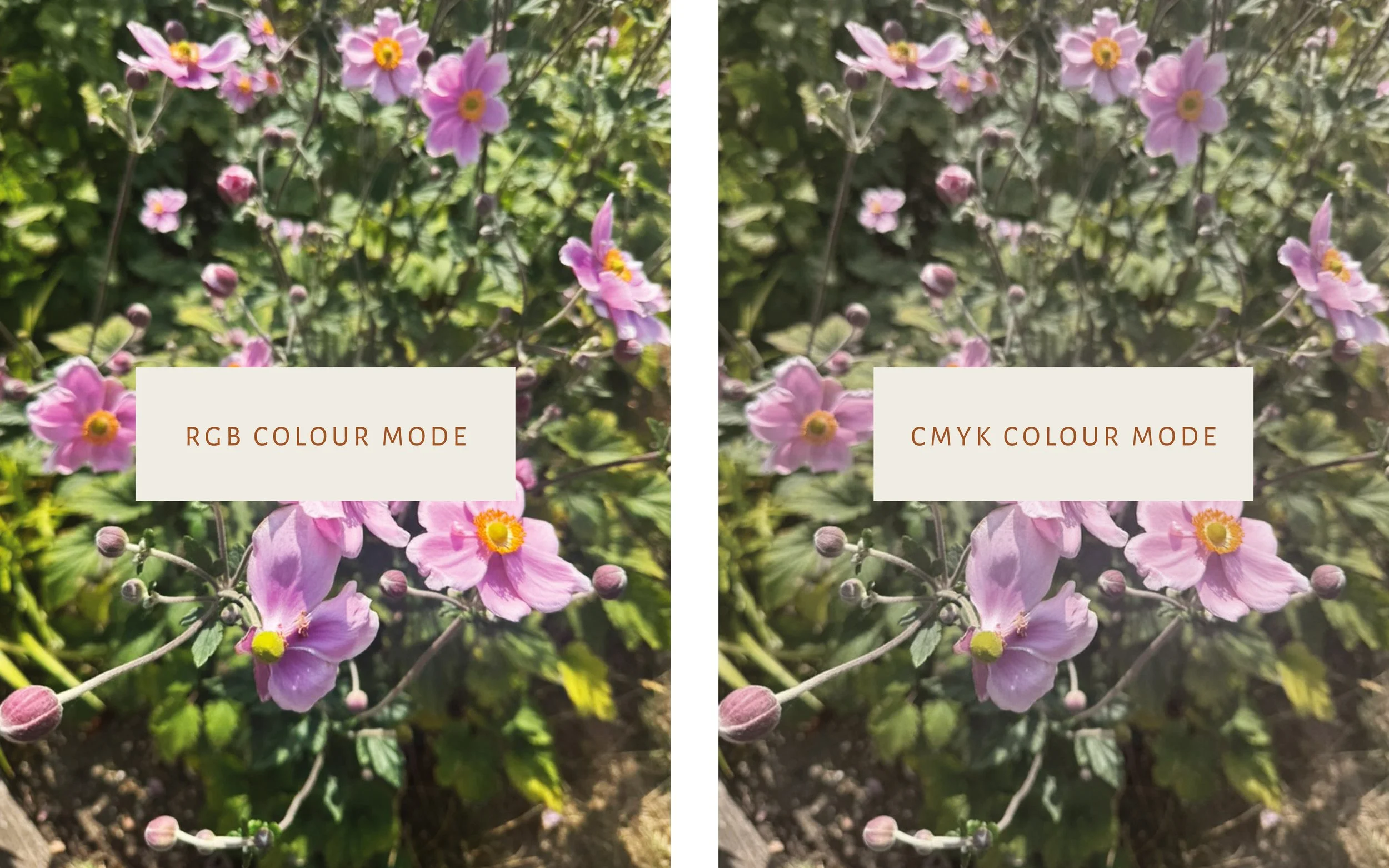
2. Colour Modes: RGB vs CMYK
It’s not just about file types… colour modes matter, too.
RGB (Red, Green, Blue):
Used for anything digital: screens, websites, and social media. It’s light-based, so colours appear bright and vibrant.
CMYK (Cyan, Magenta, Yellow, Black):
Used for anything printed: business cards, packaging or brochures. Printers layer inks in these colours, so you’ll only get consistent print results if your logo is set up in CMYK.
Having both means your brand colours look right no matter where they’re used.
3. Why Multiple Formats Matter
You might be thinking: do I really need all these? Yes. Here’s why.
Professionalism: A fuzzy logo immediately undermines the quality of your brand. Crisp, clean files build trust.
Flexibility: You should be able to hand your logo files to anyone relevant; a web designer, a printer, a social media manager and know they can use it without issue.
Future-proofing: As your business grows, your logo will need to adapt. Having the right files now saves you rework (and expense) later.
Think of it as an insurance policy: you’re covered no matter where or how your logo shows up.
4. What to Ask Your Designer For
When you invest in professional design, make sure your designer provides you with:
All file formats (JPEG, PNG, EPS/SVG)
Colour codes (RGB, CMYK, and hex)
Font files and licenses (if custom fonts are used in your brand)
A brand style sheet or guidelines (so your logo, colours, and fonts stay consistent everywhere)
Scalable vector files (EPS/AI) for anything from stationery to signage
This isn’t about being demanding, it’s about being set up properly so you’re never scrambling for “just one high-res logo file” at the last minute.

5. Time for a Logo Audit
Here’s a simple exercise: open the folder where your logo files live.
Do you only see a single PNG or JPEG? (These file types are usually written at the end of the file name e.g. File_name.png
Do you have both RGB (digital) and CMYK (print) versions?
Do you have a vector file (EPS or SVG) you can send to a printer?
If the answer is no, or if your logo still looks fuzzy online, it might be time to request the right files from your designer. And if that’s not possible, it could be the perfect moment to think about a brand refresh.
Final Thoughts
Your logo is one of your most important brand assets. It deserves to look sharp, polished and professional wherever it’s seen. Having the right file formats isn’t a luxury, it’s the bare minimum of professional design.
When it comes to design, you get what you pay for. A cheap logo might seem like a win at first, but if it leaves you with only one fuzzy or pixelated PNG, you’ll end up spending more time (and money) fixing it down the line. Investing in a professional process from the start means you’re equipped with the proper files, consistency and confidence to actually grow your brand.
How I Might Be Able To Help:
If you’re not confident that your logo is set up properly for both web and print, let’s talk. A thoughtful brand refresh can ensure you have everything you need, not just a logo, but the clarity, consistency, and professionalism your business deserves.
