The Plannery
Brand Identity & Website Design
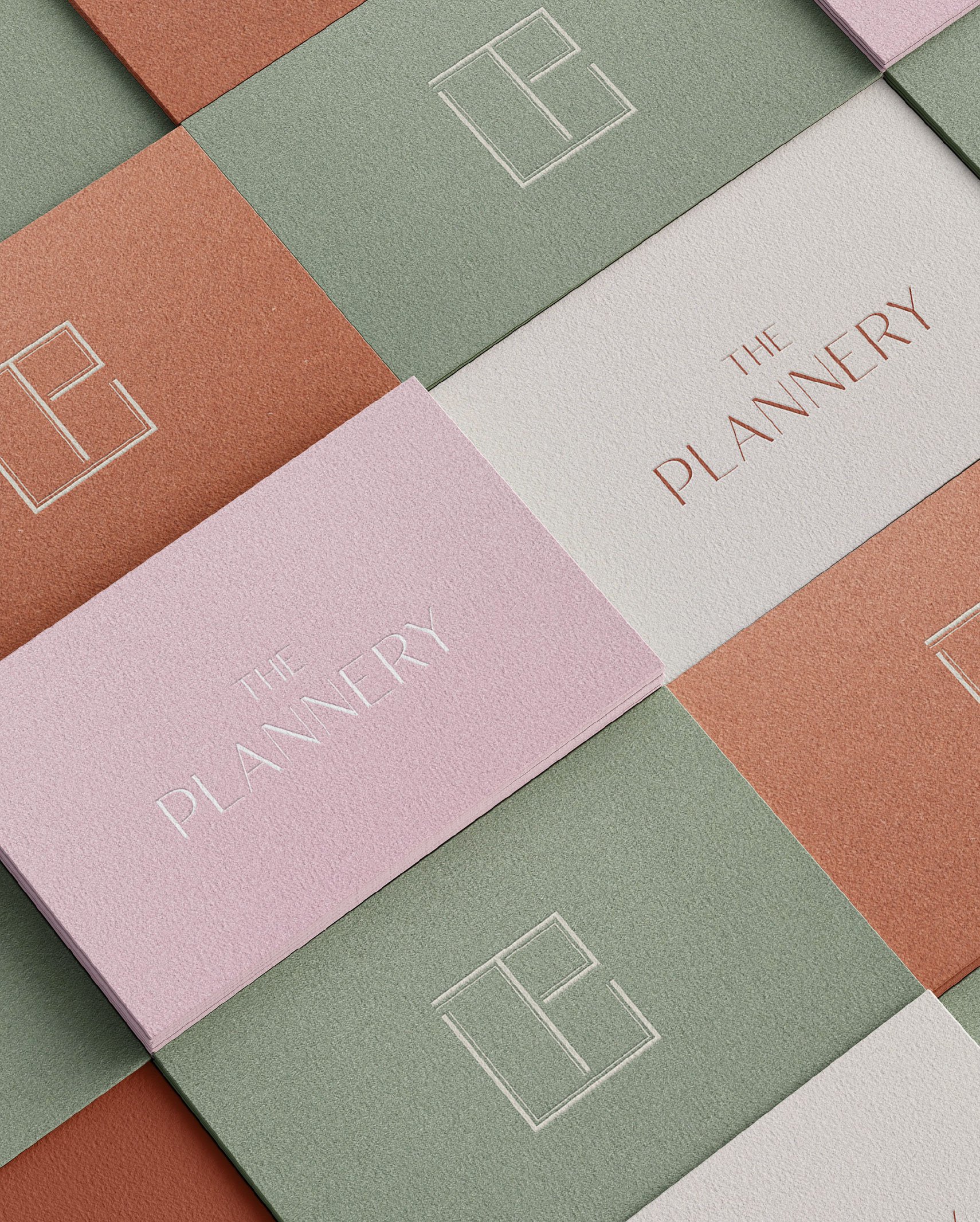
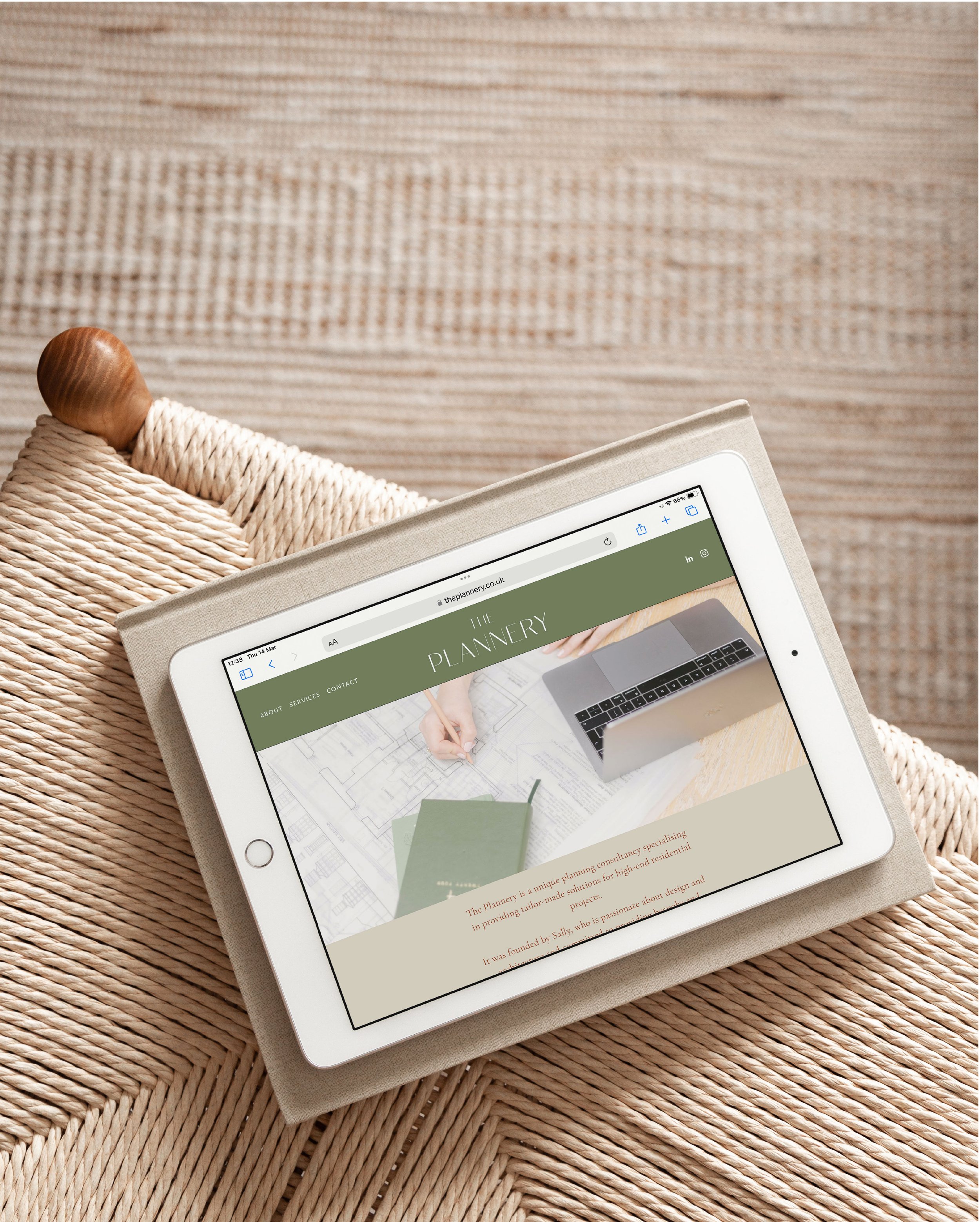
The Plannery is a boutique planning consultancy offering bespoke solutions for high-end residential projects. As a service-led start-up, the goal was to create an identity that felt both refined and quietly distinctive.
The brand symbol subtly connects the letters ‘T’ and ‘P’ within a structured square—echoing the architectural feel of a floor plan, without being too literal. The result is a minimal, considered identity that reflects the clarity and precision of Sally’s approach, while offering flexibility as the business grows.